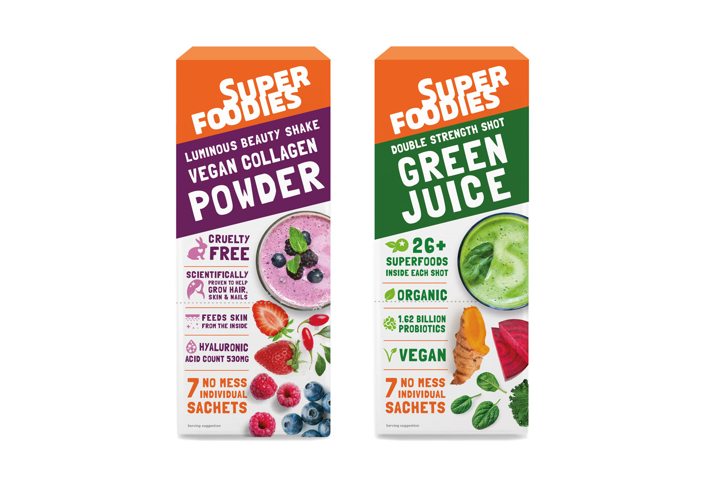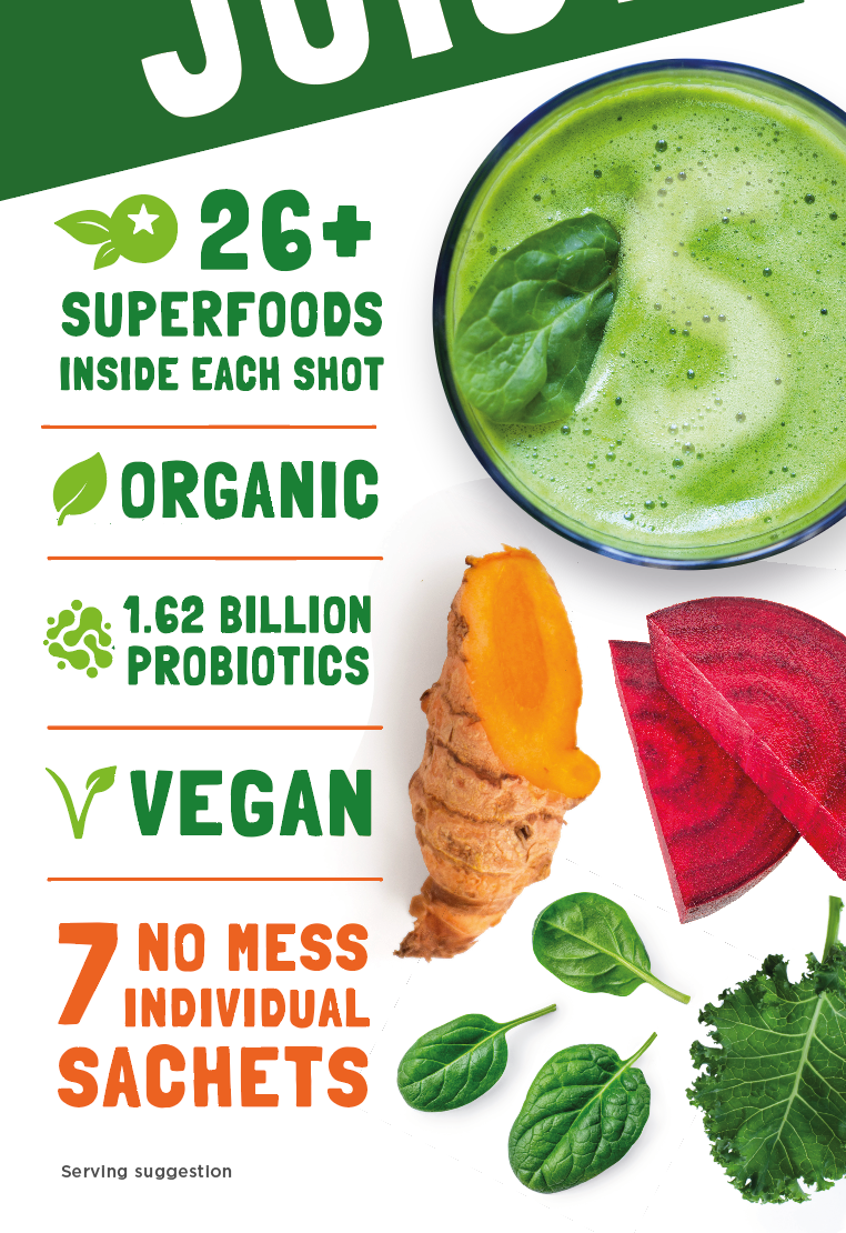

Superfoodies wanted an update to their Green Juice packaging to make the product benefits more immediately obvious. The design needed to work with the existing angled logo design.
The product title follows the angle of the logo to ensure it is as large as possible. The product benefits are bold, with icons to help communicate the offering more quickly.